Midterms are coming. You need students to practice but don't want to hand them a review sheet and say "do that." Oh, and you only graded one project this quarter, somehow? Note to self: collect things occasionally and give kids feedback. So what do you do? Assign a project that encourages review! The goal is not just practice but the synthesis kind of review and I think this project does that! The task is to collect data that is approximately sinusoidal, write an equation to fit the data and then interpret.
Last year I had students write a model for the hours of daylight where each pair got to choose a location, I printed off a ton of data and had them graph by hand. I failed the "use appropriate tools strategically" standard. Graph paper + graphing calculator is not a good way for students to efficiently graph or to easily check their graph. This year I improved, we used Desmos.
When students arrived to class this year there was a laptop cart in the room. Students signed out a laptop and grabbed this instruction sheet:
They all sat quietly and worked the entire period. Some talked to partners. Some asked questions. They were content when I sent them back to the instructions or their notes to answer their own questions. Desmos worked. The Internet worked. Groups who weren’t happy with the options did their own research. It’s nice to have an easy, self sufficient class sometimes!Last year I had students write a model for the hours of daylight where each pair got to choose a location, I printed off a ton of data and had them graph by hand. I failed the "use appropriate tools strategically" standard. Graph paper + graphing calculator is not a good way for students to efficiently graph or to easily check their graph. This year I improved, we used Desmos.
When students arrived to class this year there was a laptop cart in the room. Students signed out a laptop and grabbed this instruction sheet:
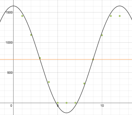
Students have used Desmos on one other occasion and the table feature was new to them. The only person who got stuck making a table didn't read the instructions. We definitely "used appropriate tool strategically" this time - the technology allowed students to quickly compare their model to the data. A few people tried to guess and check but found that their curve wasn't hitting the points, it was much more efficient to use what they knew about period, amplitude and shifts to get an accurate model.
Grading these projects was fun! I opened up my email, read about many different sets of data and different interpretations of the data. It's great to have assignments where students have different topics because it makes things more interesting for the students and for me, but usually it's a lot more work to grade projects that are all different since I have to check each set of calculations. In this case, I looked at the graph and if it matched well and their analysis made sense that was all I had to do! Then I sent an email back with feedback. So easy. And I got to read things like this:
I chose to graph the minutes of daylight in Antarctica. My X axis is the Months and my Y axis is the amount of daylight (in minutes). My model does not display perfect accuracy but that is because Antarctica runs out of sun light at some points and it can't have a negative amount of daylight. Also that I did every 21st of the month so it's not the same amount of days in between each selected time.
As my real world periodic function, I chose to analyze the stages of the moon during its period in the month of January. The "synodic period" of the moon is exactly 29.5305882 days, however in this graph, the period is simply 30. The rough equation derived from this data (what percentage of the moon is seen illuminated in Salem Massachusetts throughout the month of January) is y=50sin(.2094x-1.68)+50, where y is the percentage and x is the day of the month. We can determine that this equation makes sense in context because in the equation, the period (30 days) is the rough length of one synodic period and the amplitude is in fact half of the total percentage possible in regard to the moon being illuminated by the sun (100%, Full Moon). The accuracy of this equation is not perfect, my assumption is that this inaccuracy is due to both the gravitational forces acting upon and between the earth, moon, and sun as well as the angles created by these 3 celestial bodies as they revolve around one another in space and their speeds change.
The topic we chose is the average temperature each month in Salem MA. One period represents the 12 months within a year. Year after year the temperatures are the same on average and it is shown with this periodic equation. In context this equation shows what each coefficient and constant represent. The coefficient before sine is a. A equals 22 because a is amplitude and amplitude is found by subtracting the lowest average temperature from the highest average temperature in this set of data then dividing that answer by 2. In this equation b is 12. 12 represents the number of months represented per period showing that 1 period is equal to 1 year. The model of the data versus the actual data fit more accurately than one would have expected. It is not perfect however. Since temperature is an always changing factor and periodic graphs are repetitive and stay the same the periodic graph does not match exactly.
I love the handout. I wish that I had been that organized in advance when I tried something similar with my Precal Honors gang. My lack of advance organization meant that I had to be more involved in 'steering the ship' this would have helped my guys venture out on their own.
ReplyDelete